Photography
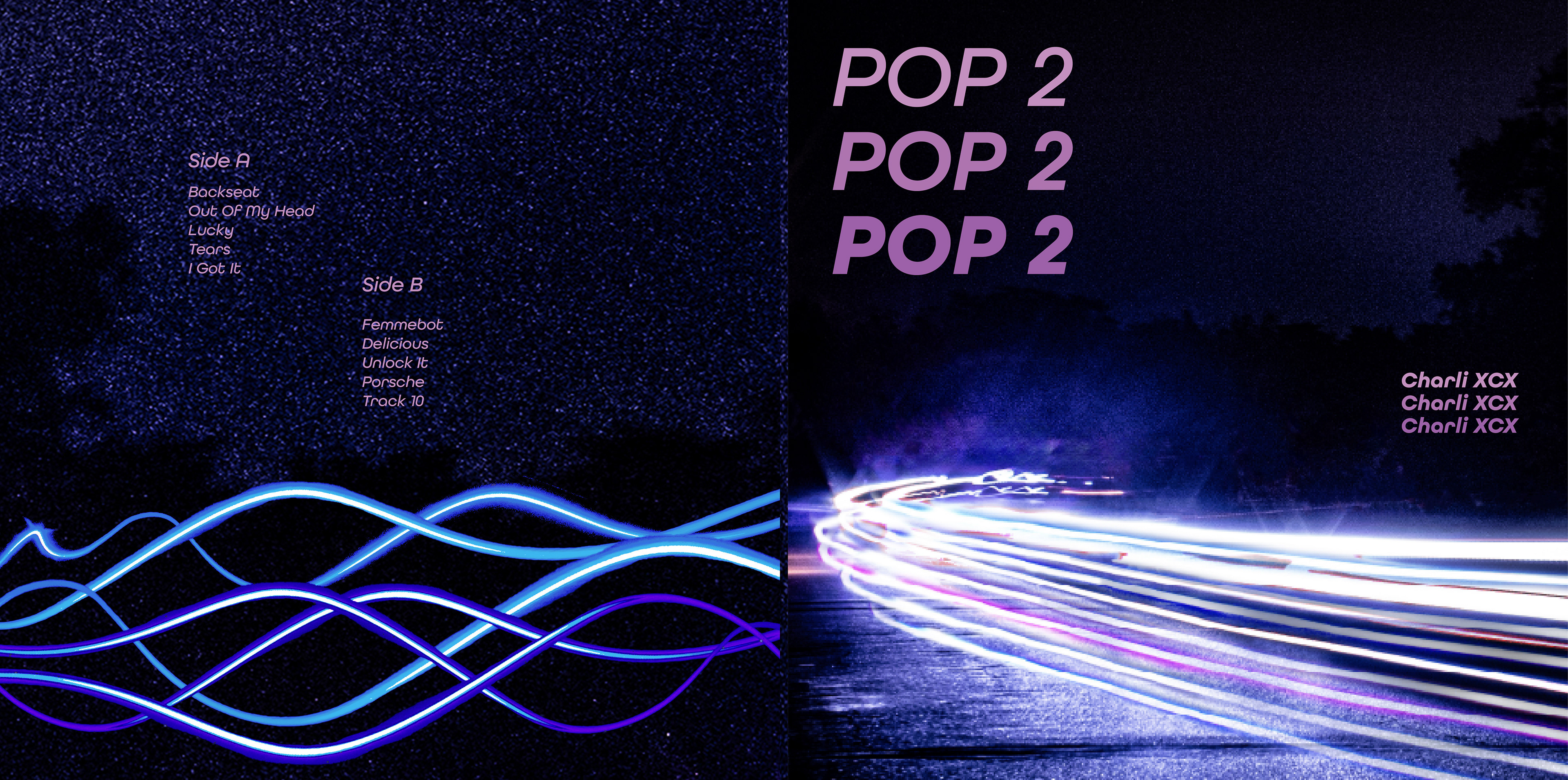
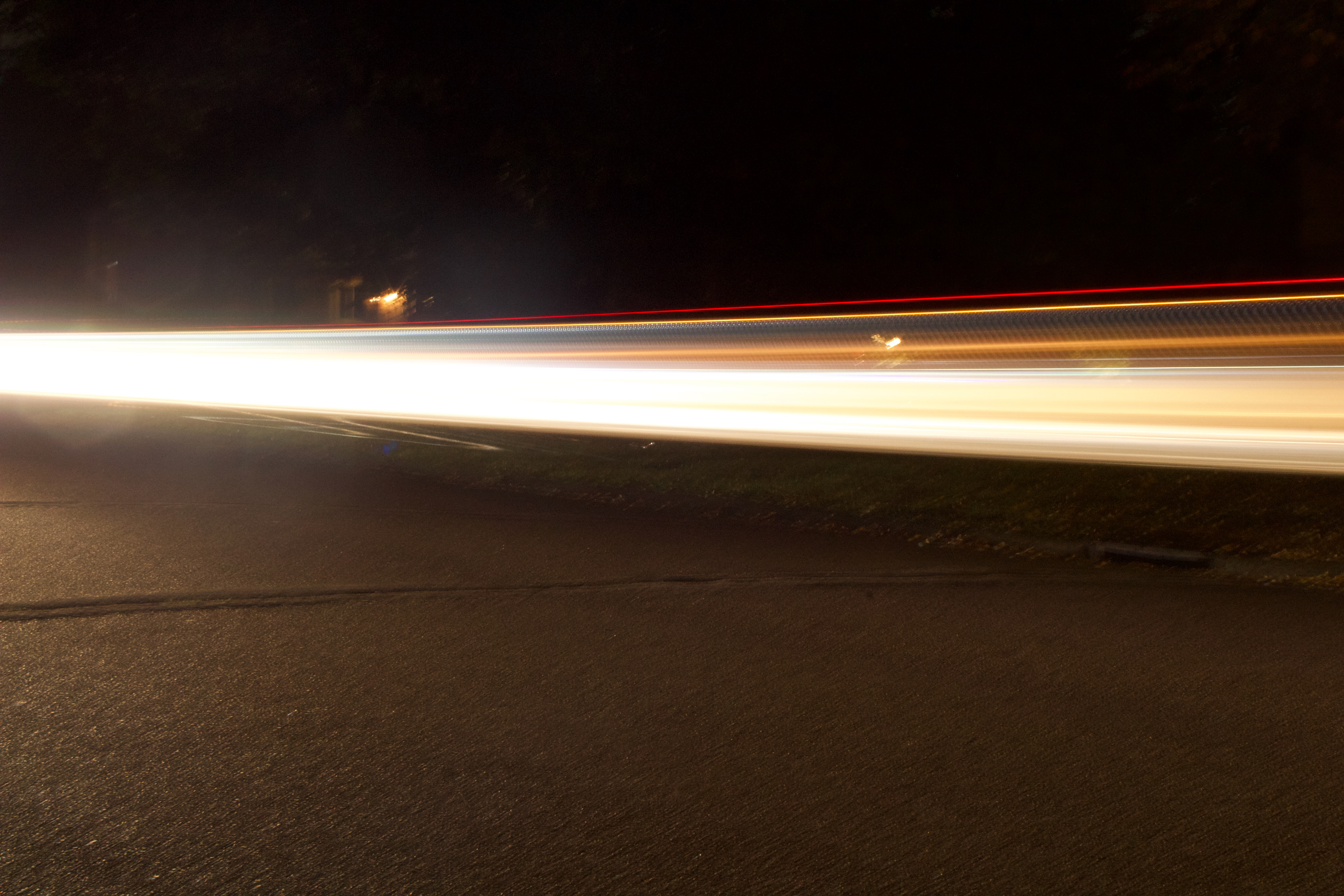
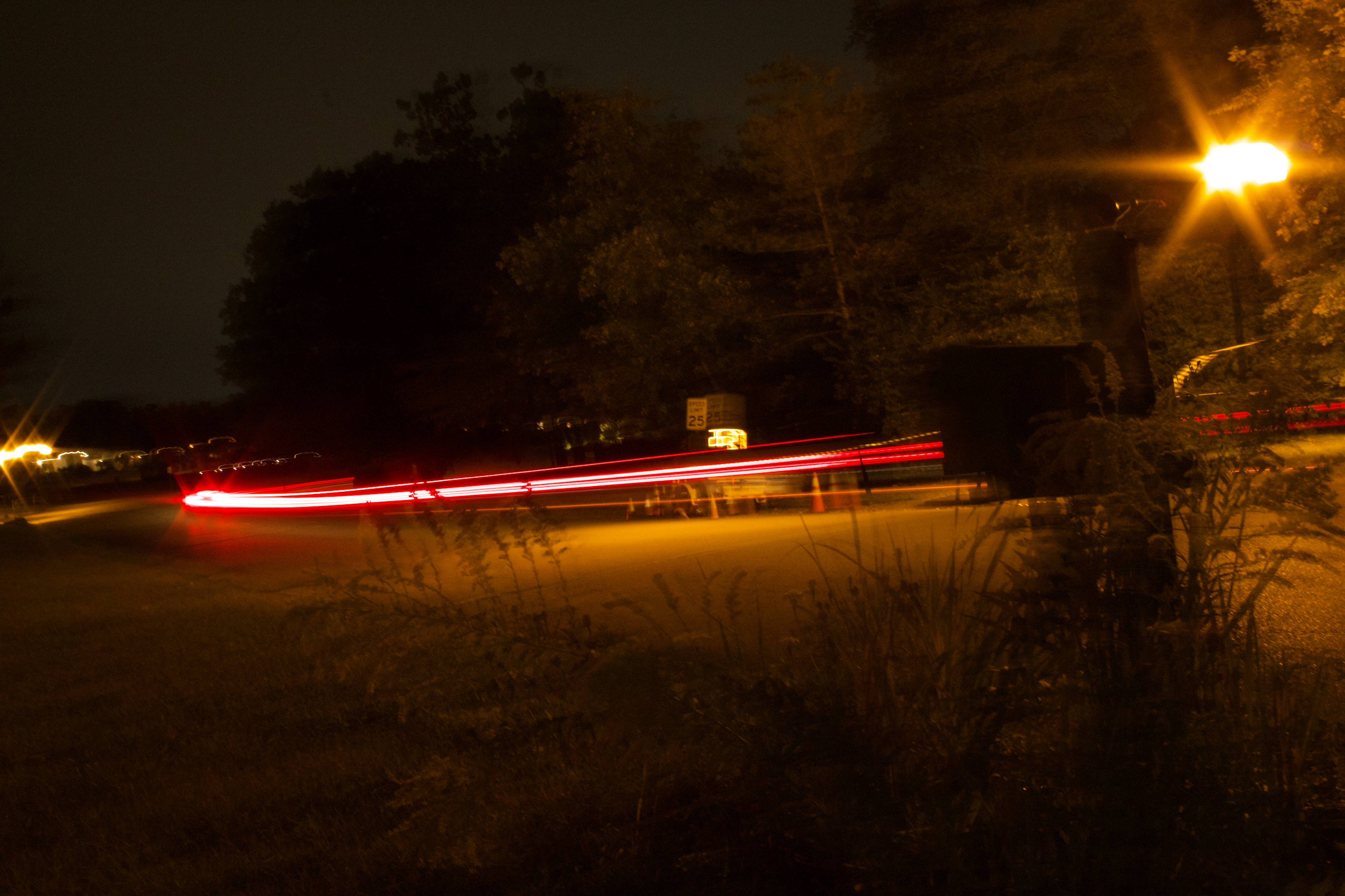
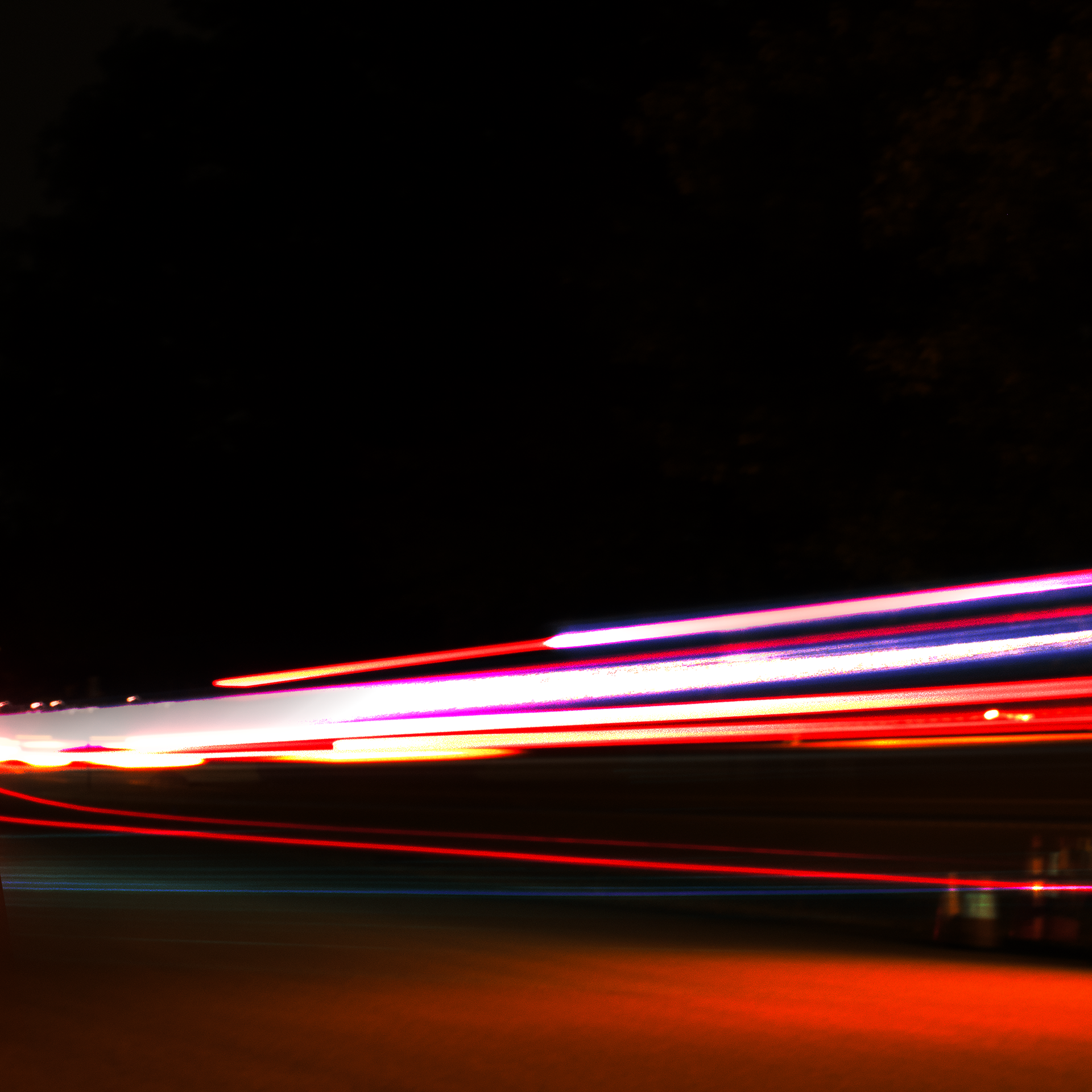
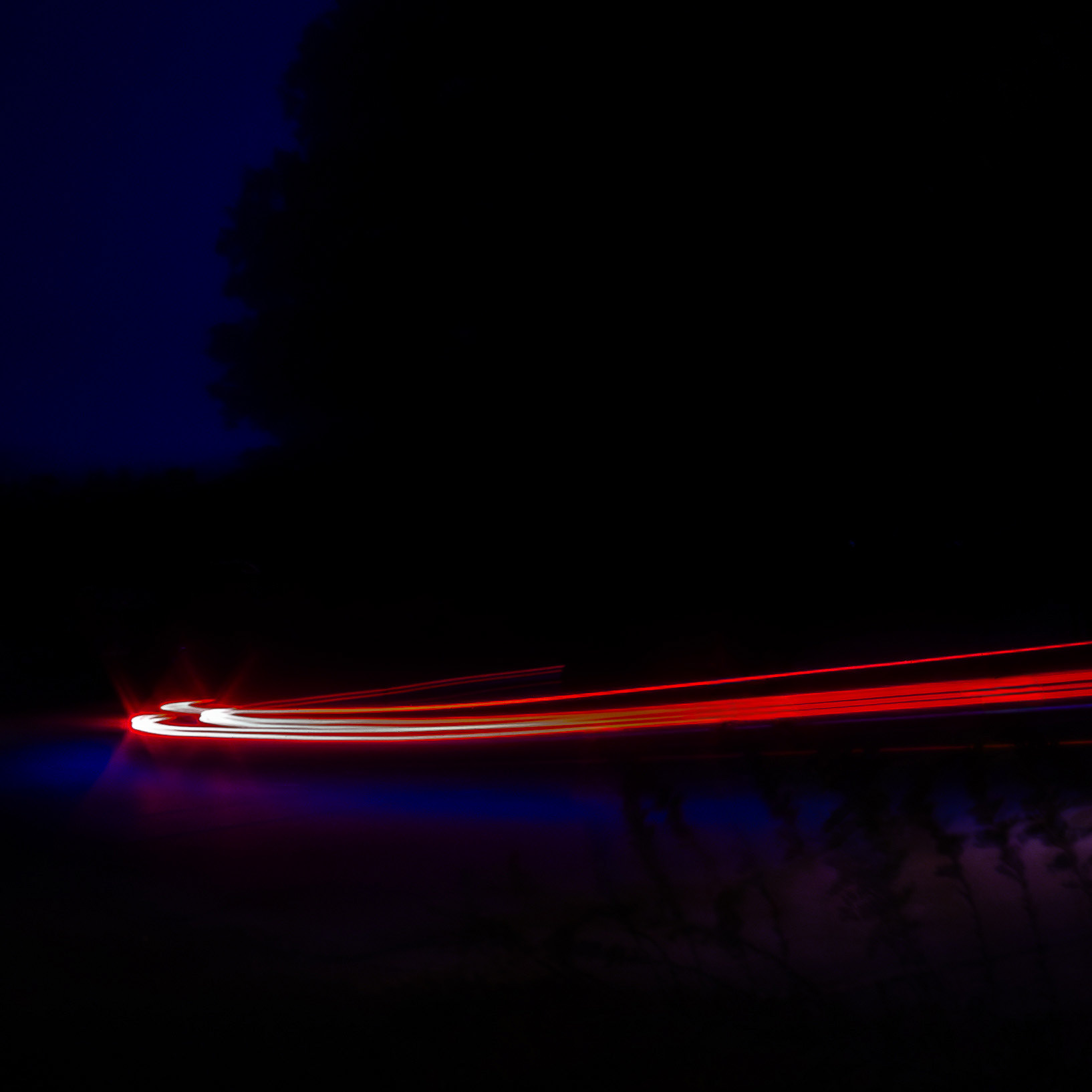
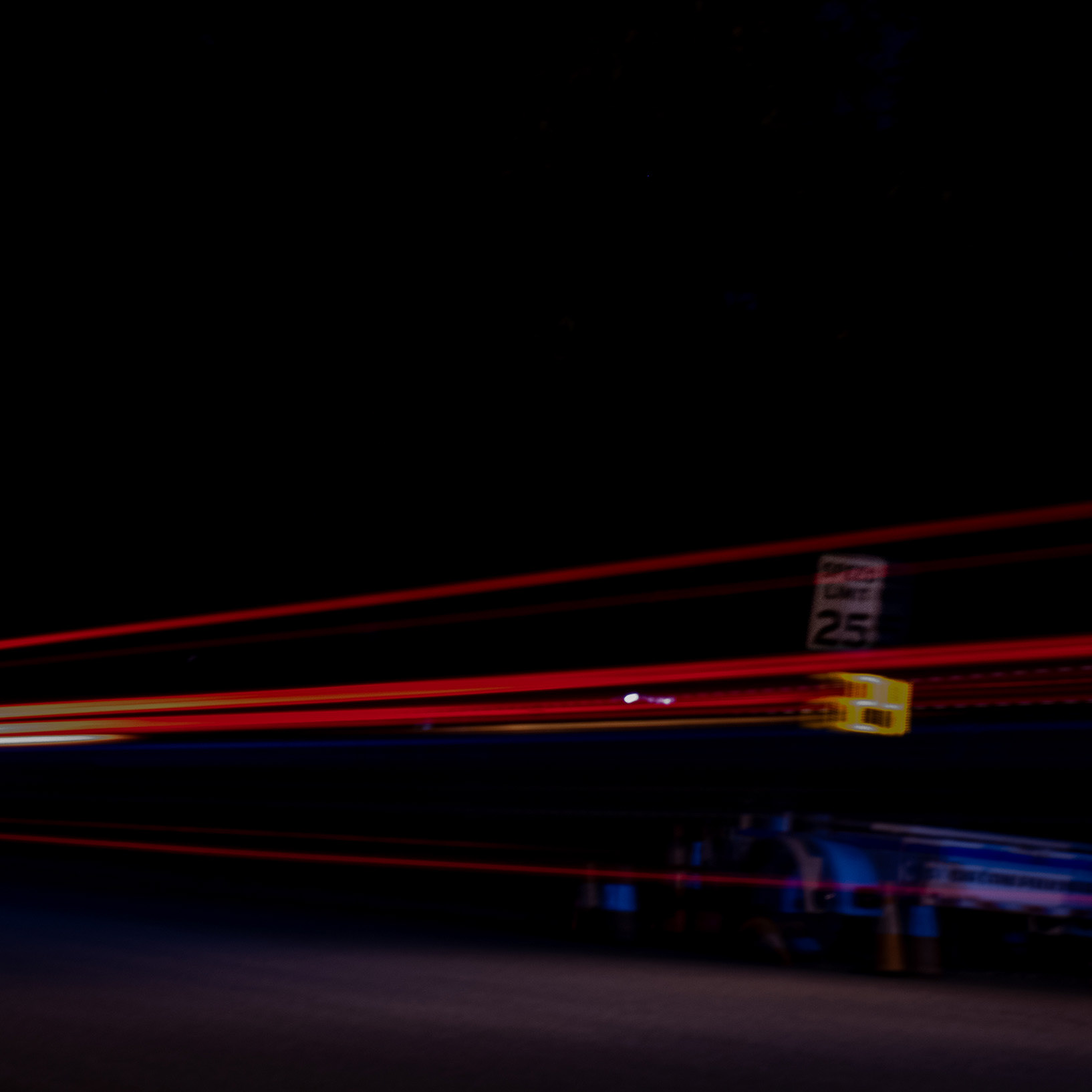
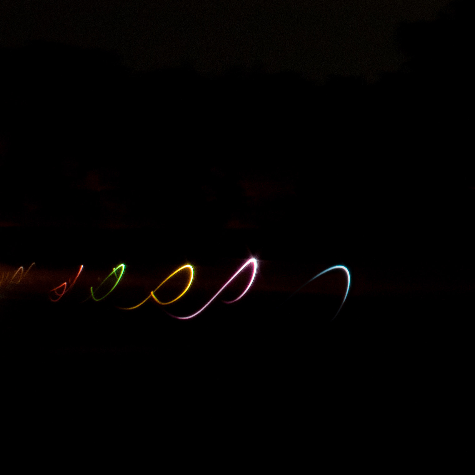
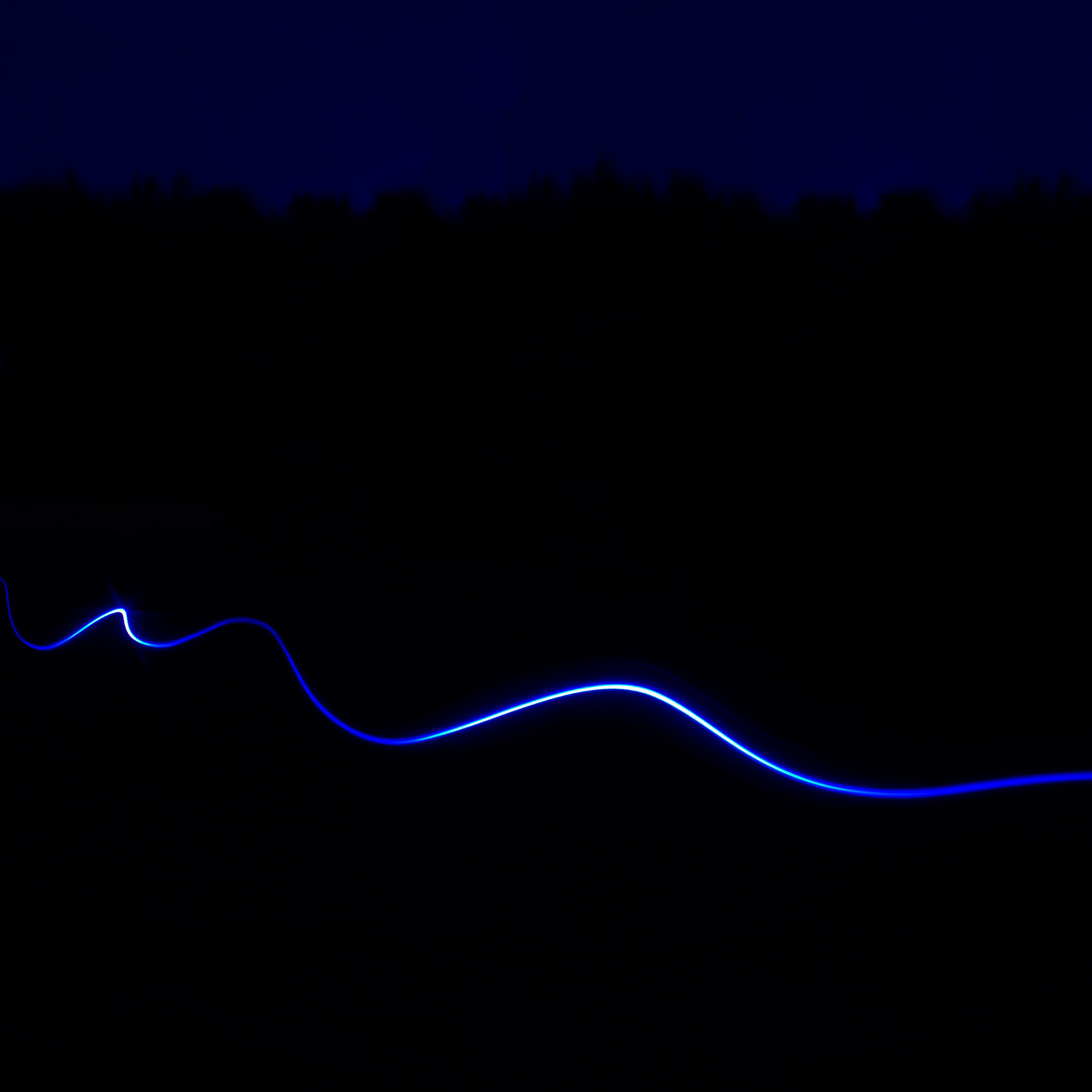
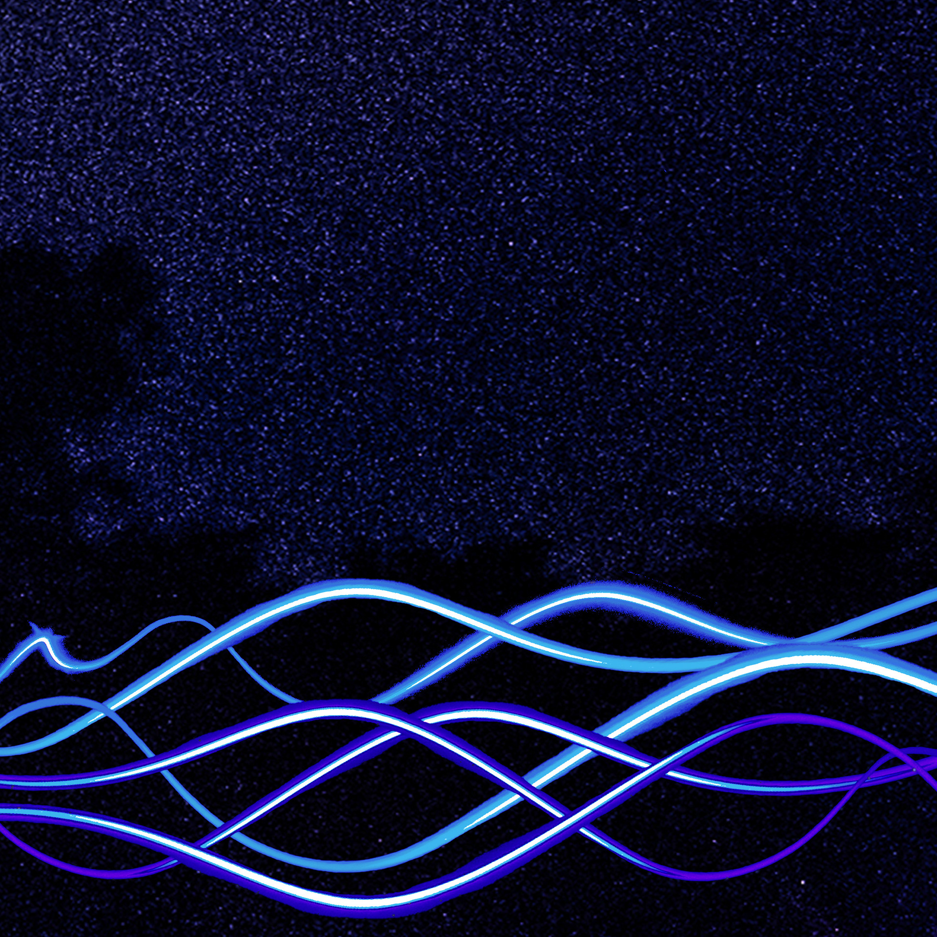
Long exposure photography of passing cars at night was the visual foundation for this project. The unpredictable light trails mirrored the album's chaotic, layered sound. Images were edited in Photoshop to heighten contrast and push the color into the purple and blue range that defines the final palette.
Original - These long exposure shots established the visual foundation for the project, capturing light trails and movement at night. On their own they felt too quiet, lacking the chaotic, layered energy the album demanded.
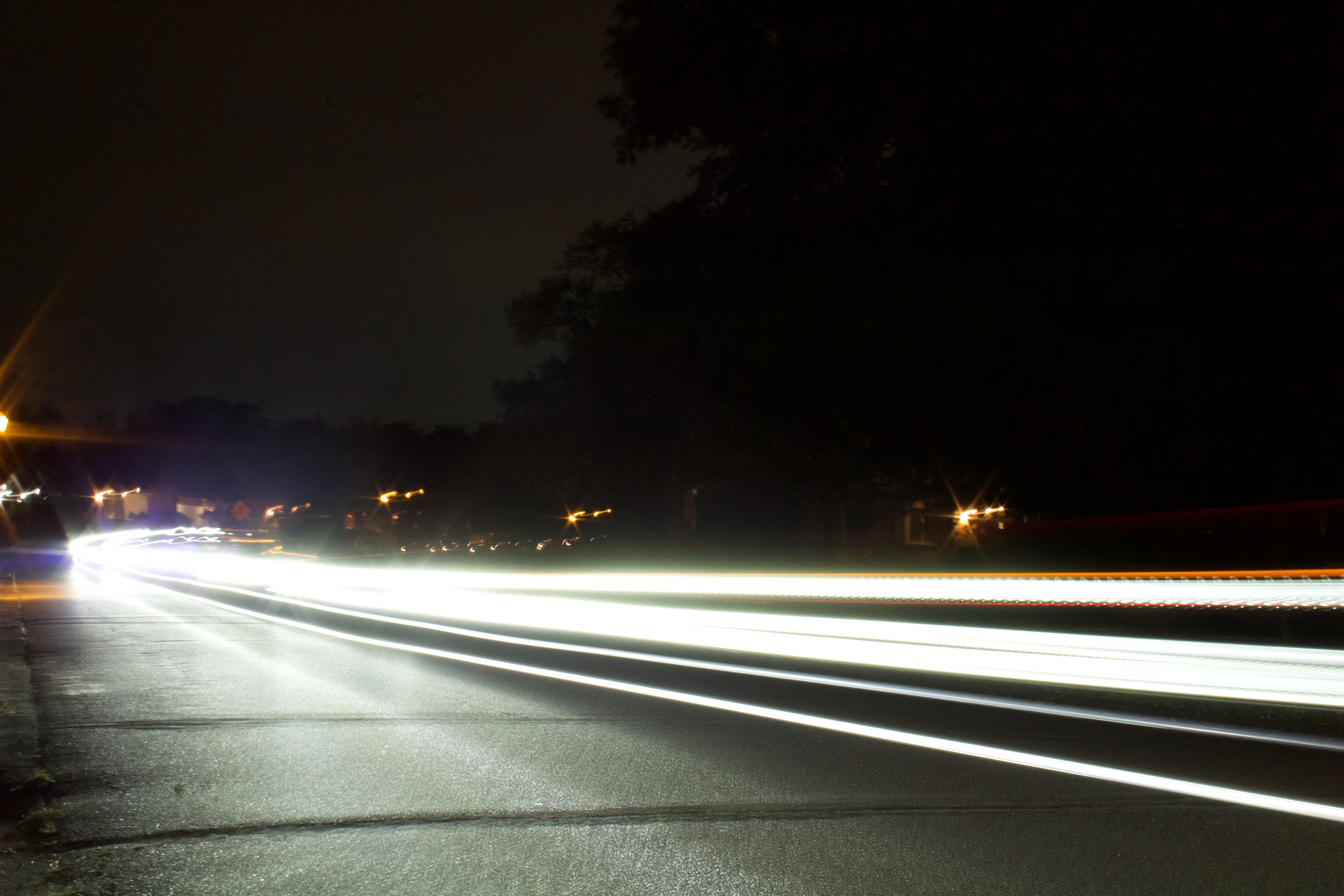
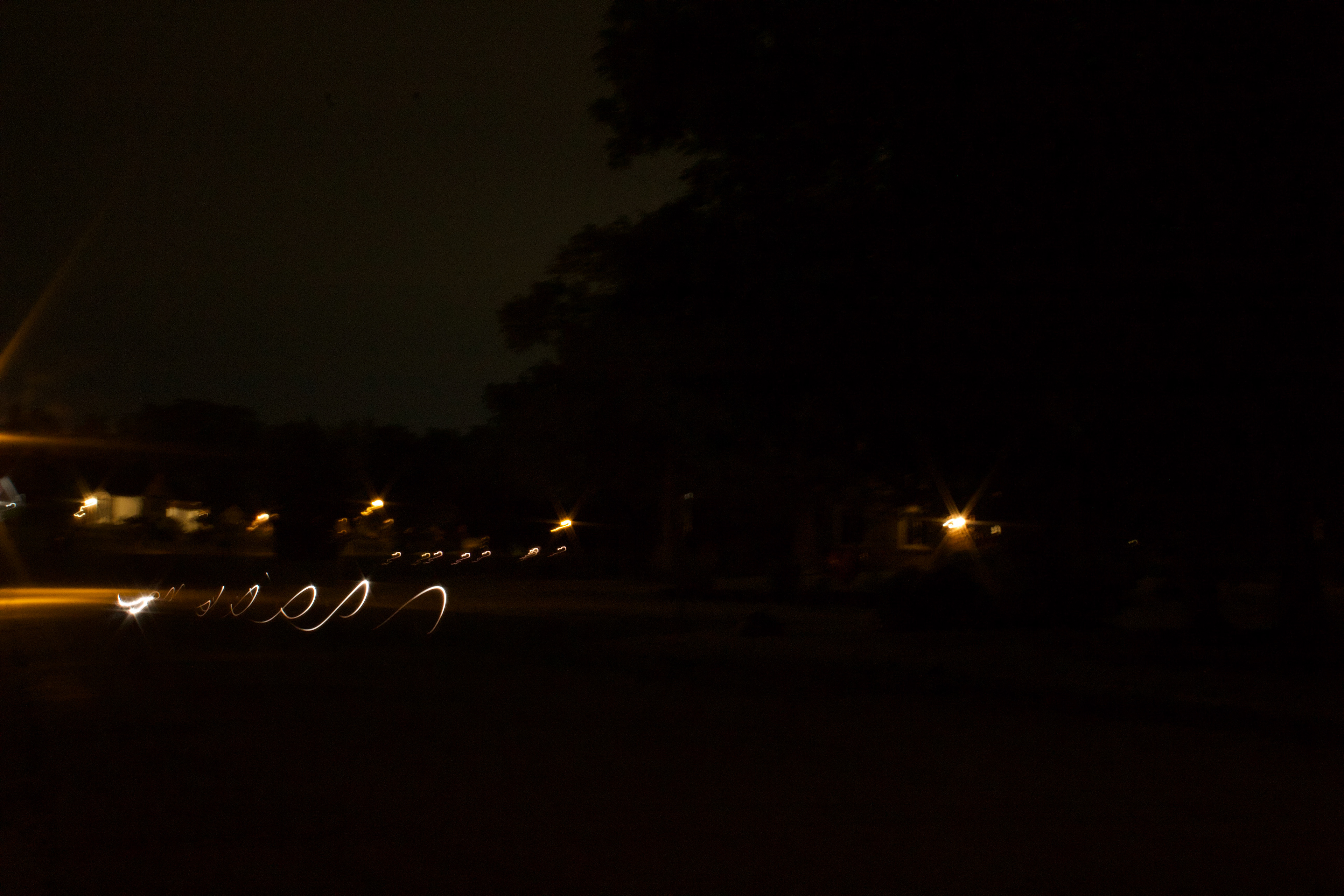
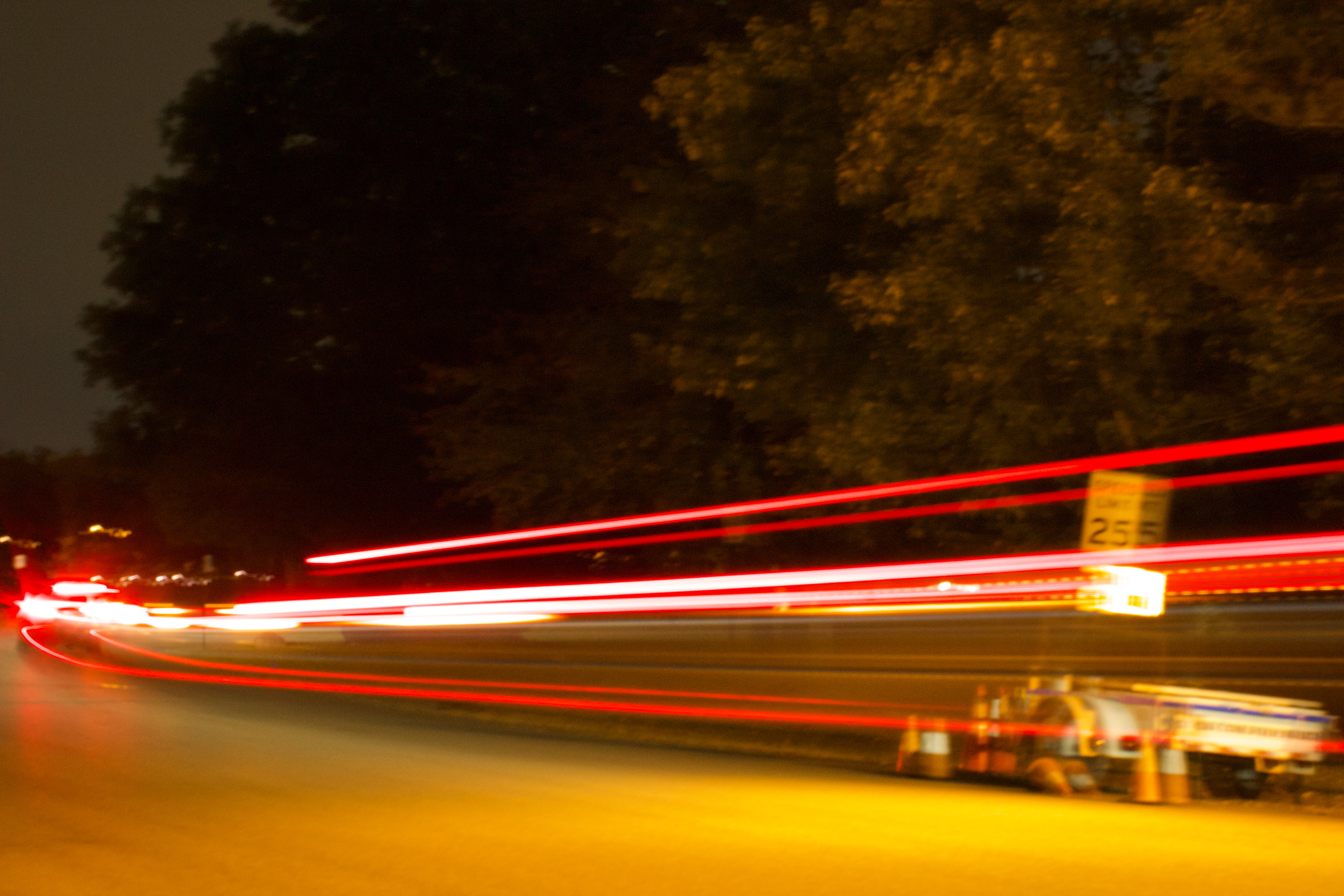
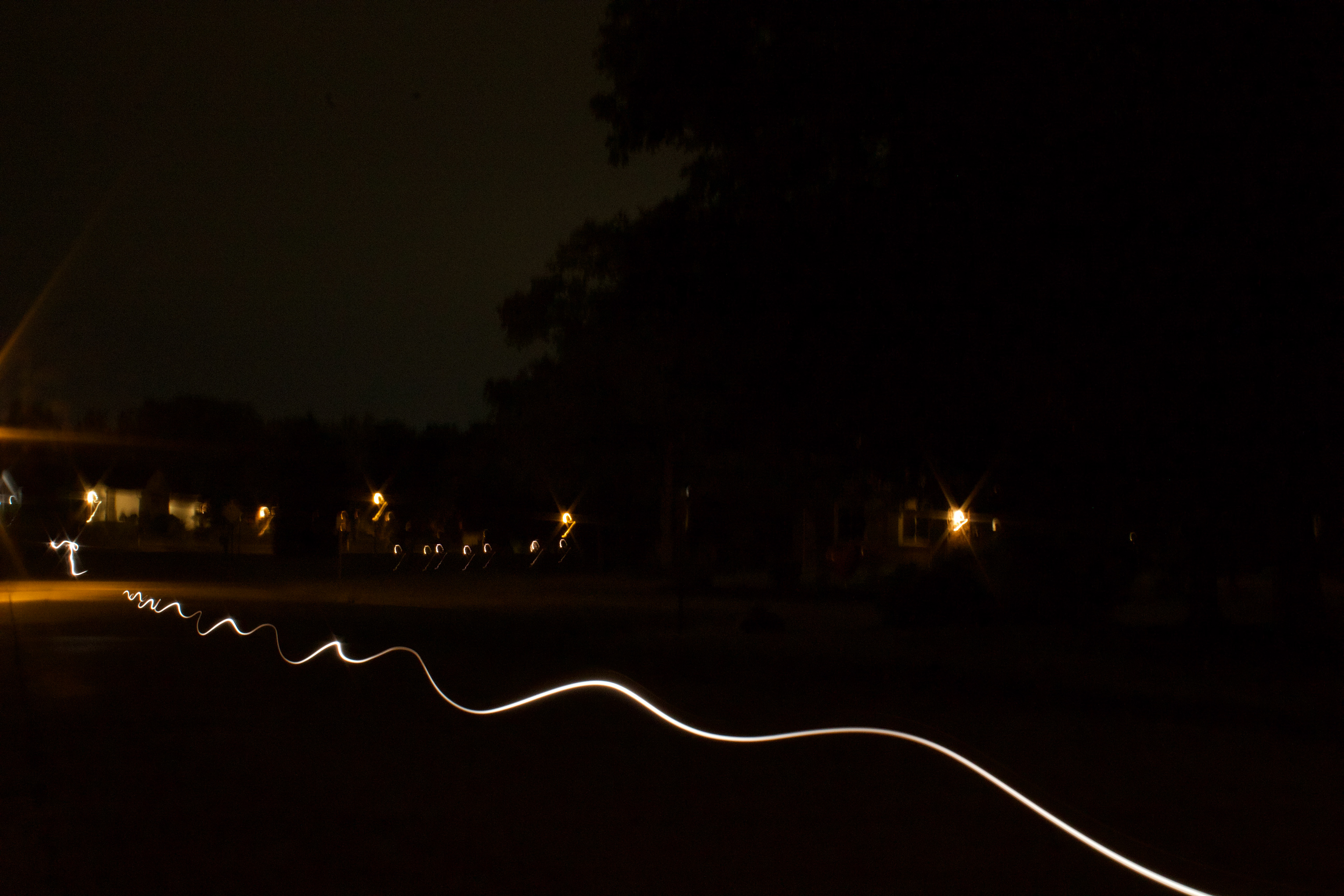
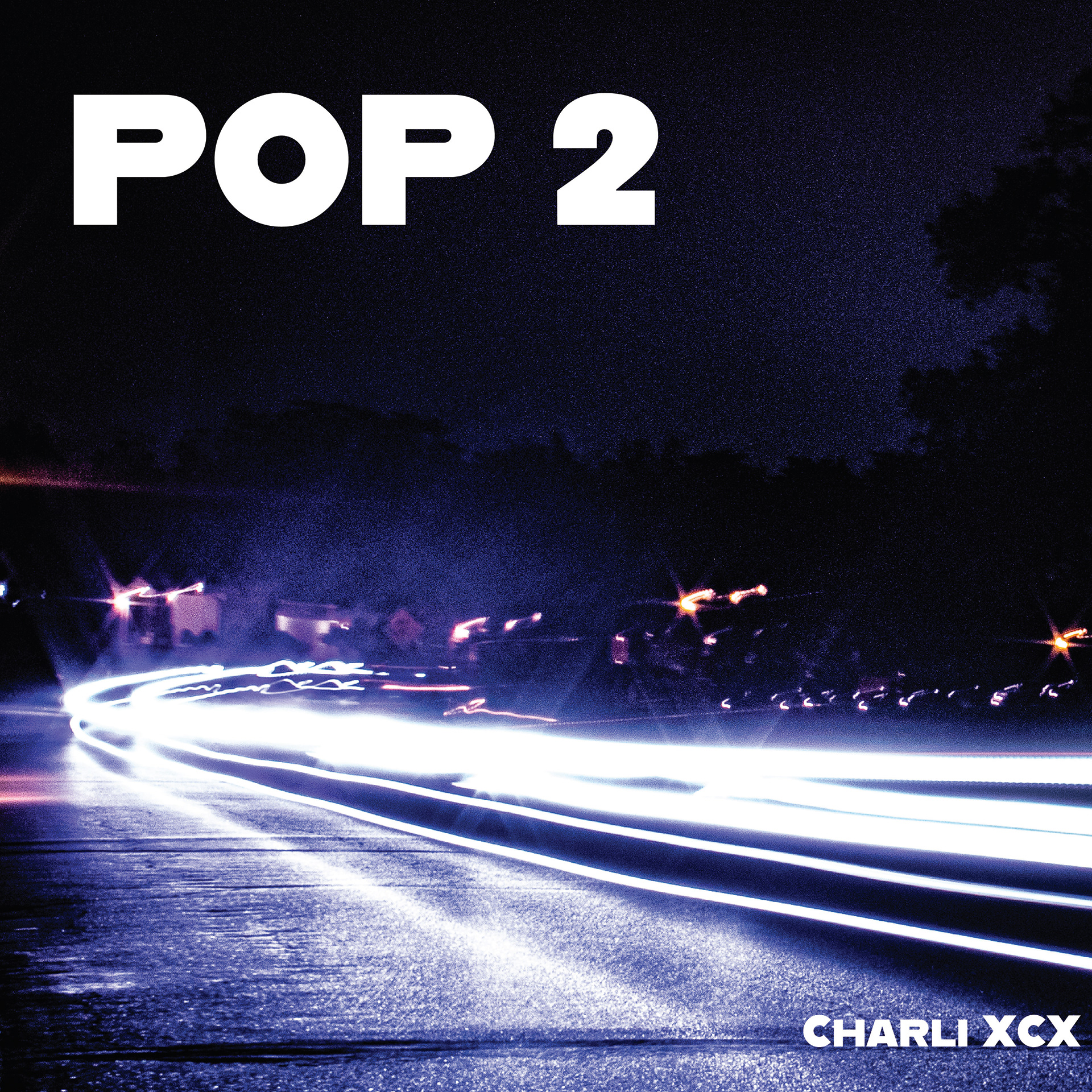
Edited - The images were pushed further in Photoshop, amplifying color into electric blues and purples and heightening contrast to give the light trails a sense of intensity and unpredictability that matched the album's sound.
Typography and Colors
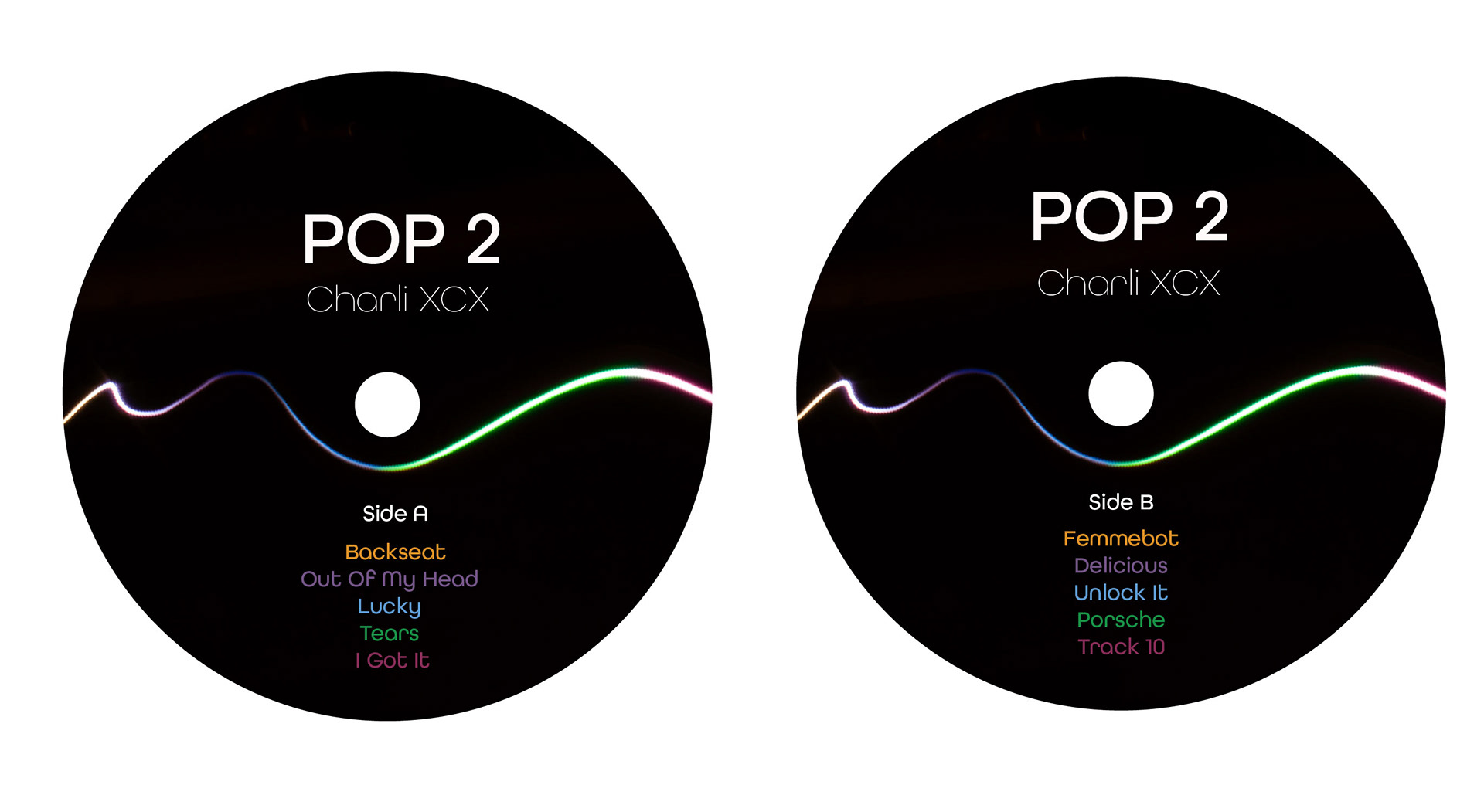
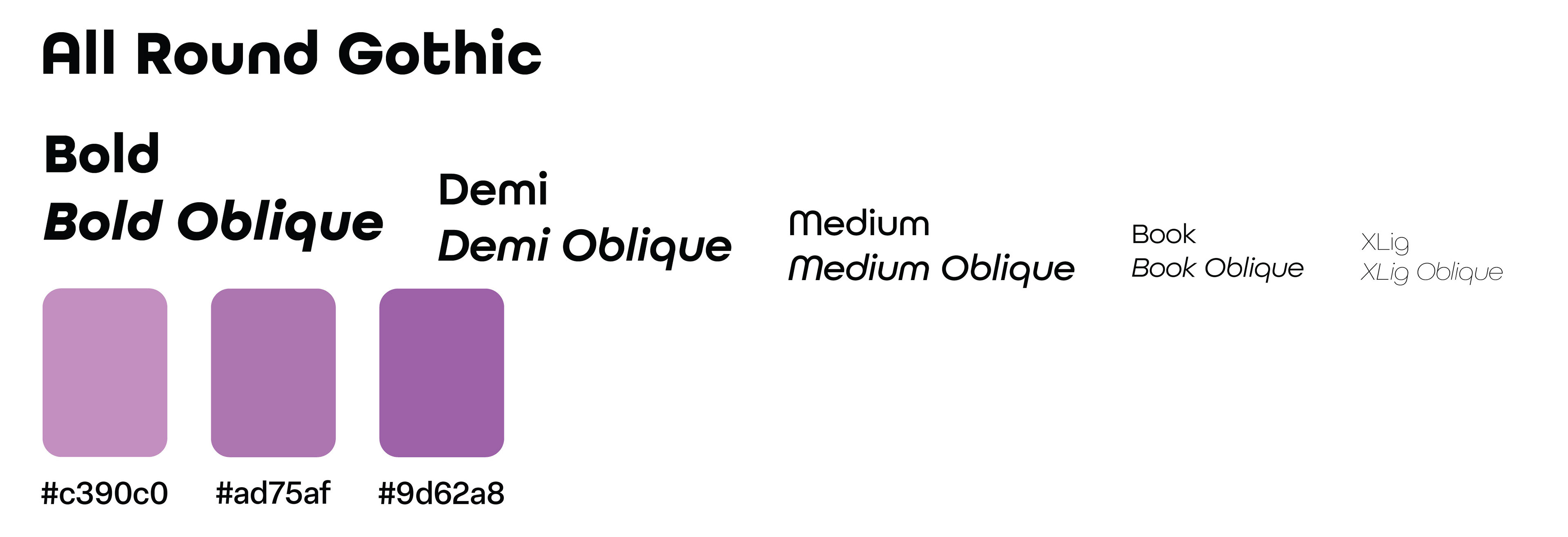
All Round Gothic was chosen for its range across weights and its balance between bold and approachable, reflecting the album's shifting between pop accessibility and experimental distortion.
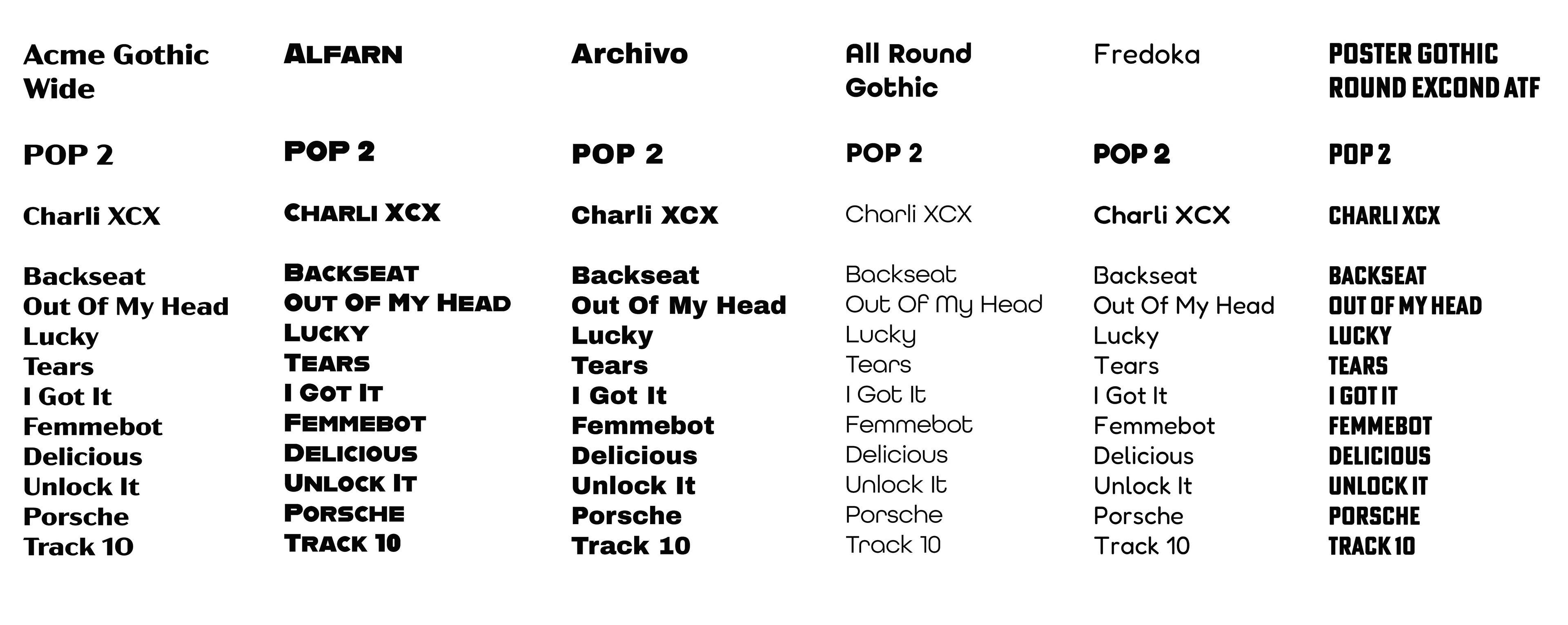
Typeface Studies - Typefaces were explored with the goal of finding something bold and loud yet still welcoming, ultimately aligning with the energetic but approachable tone of the album.
Final Type and Colors
Iterations
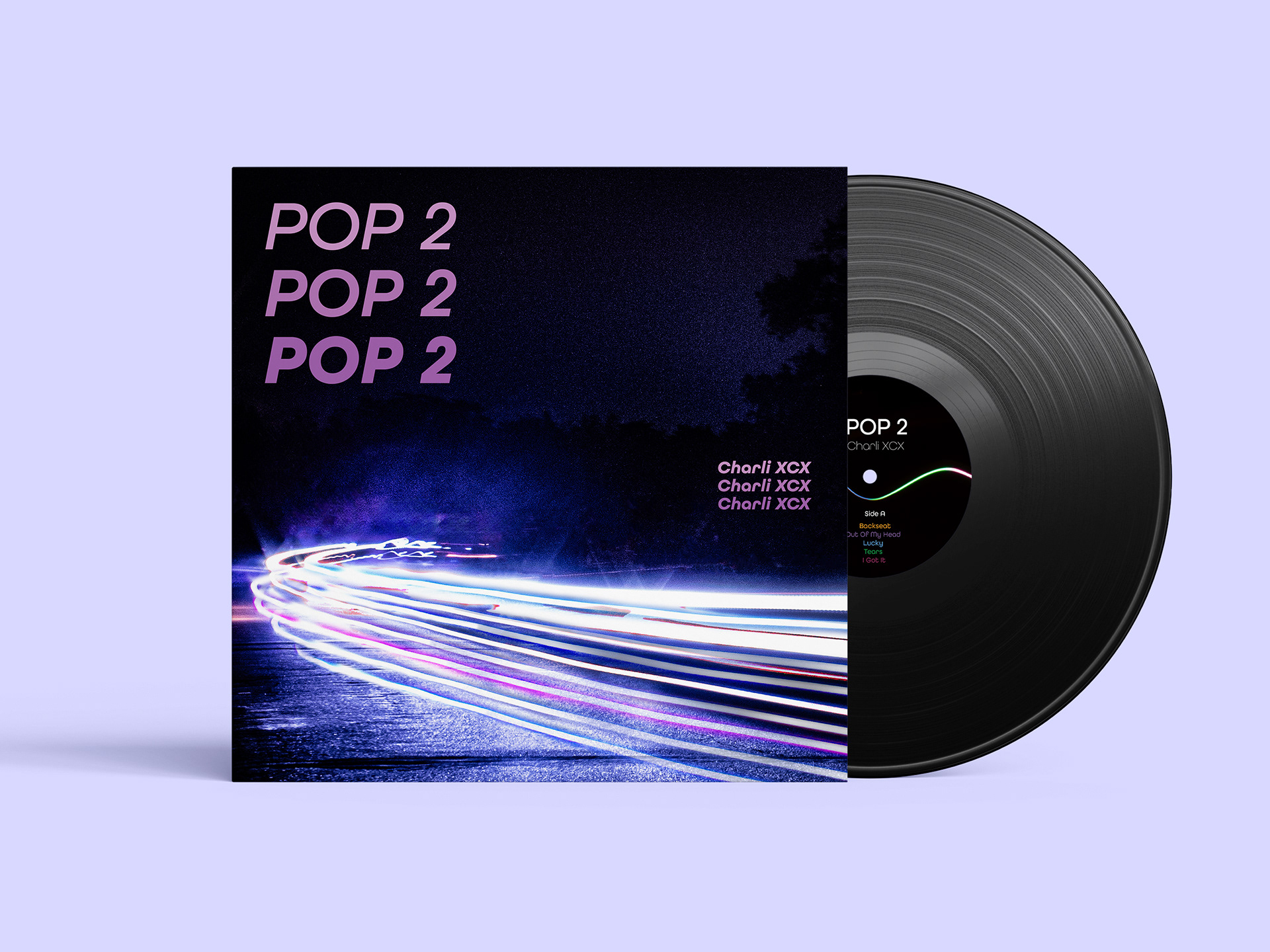
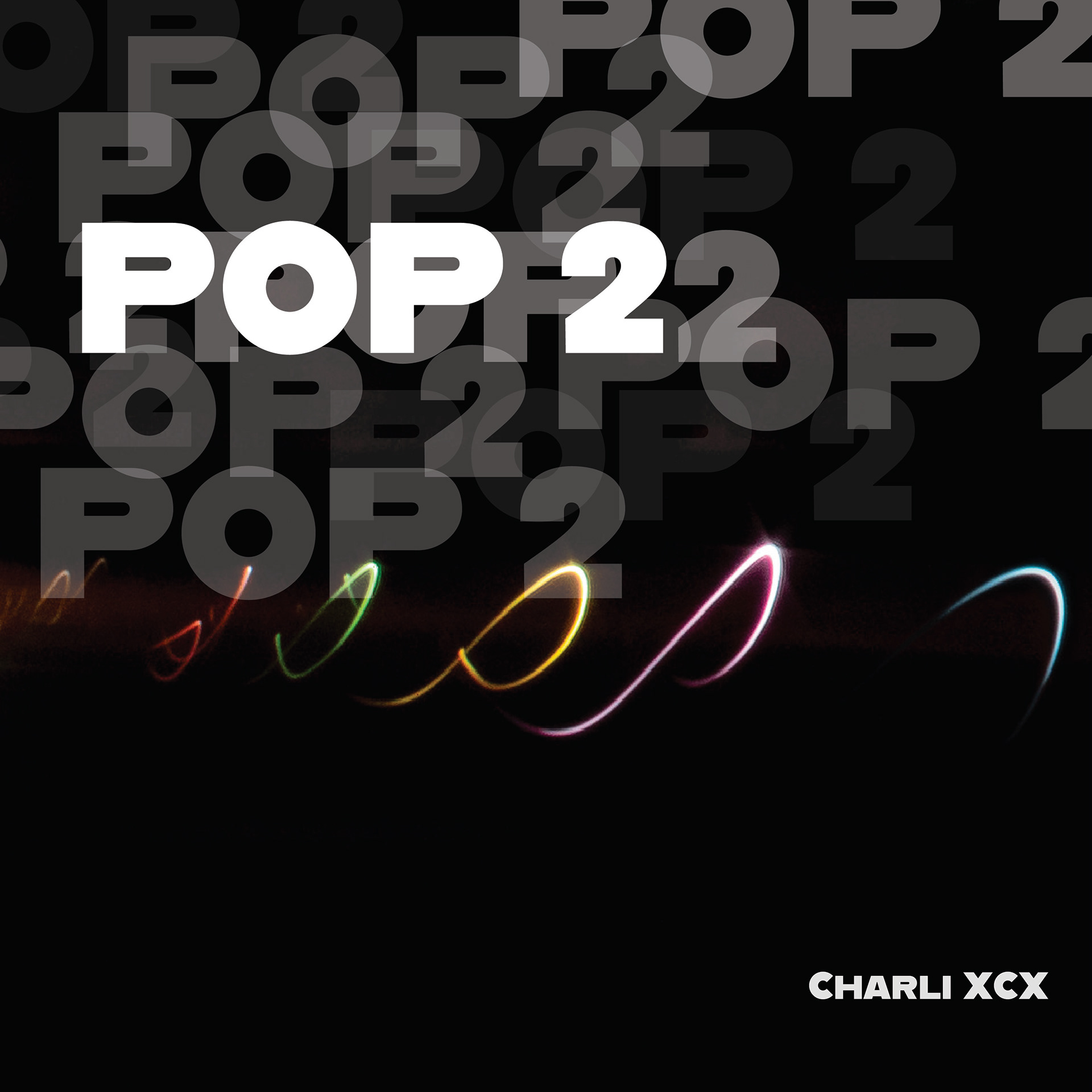
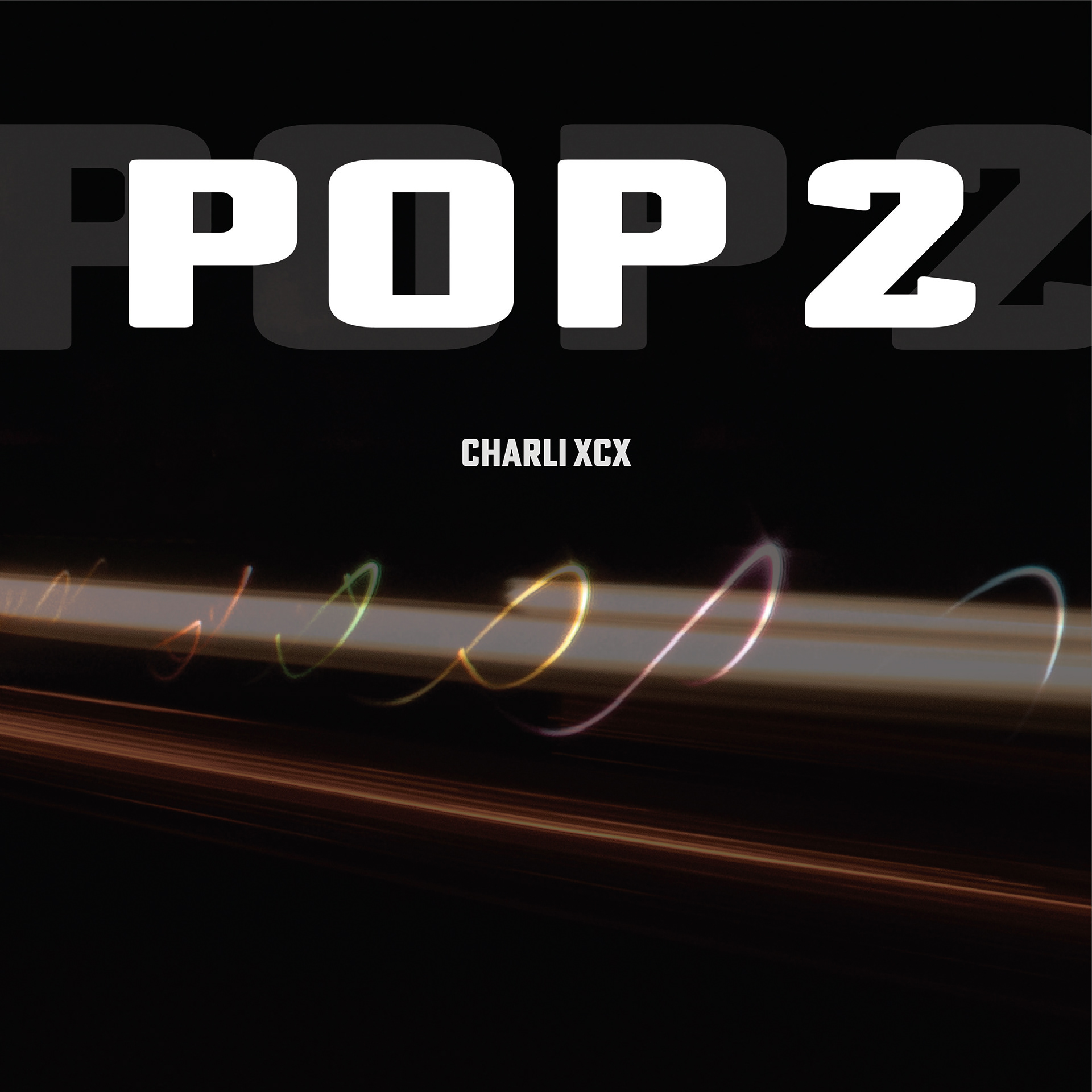
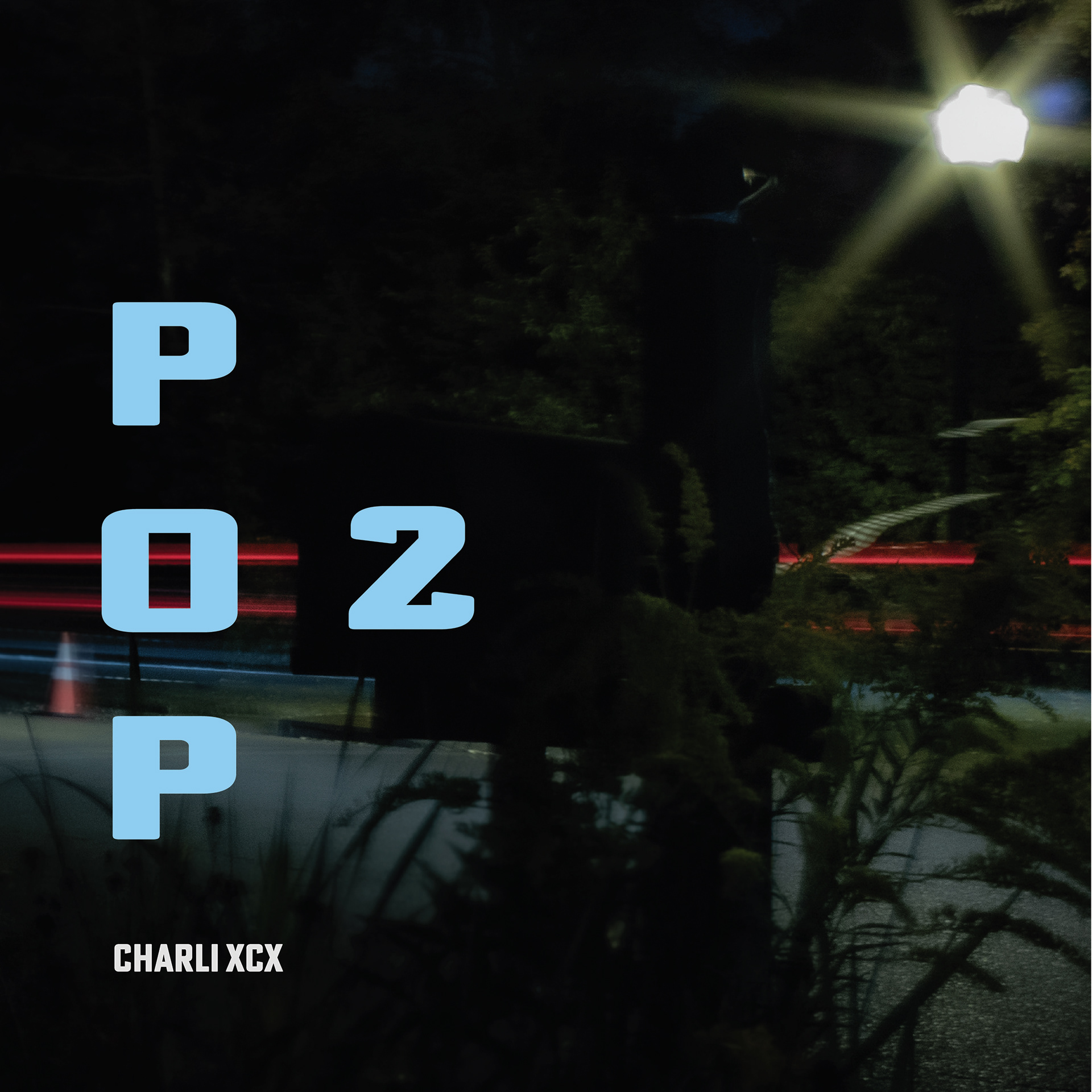
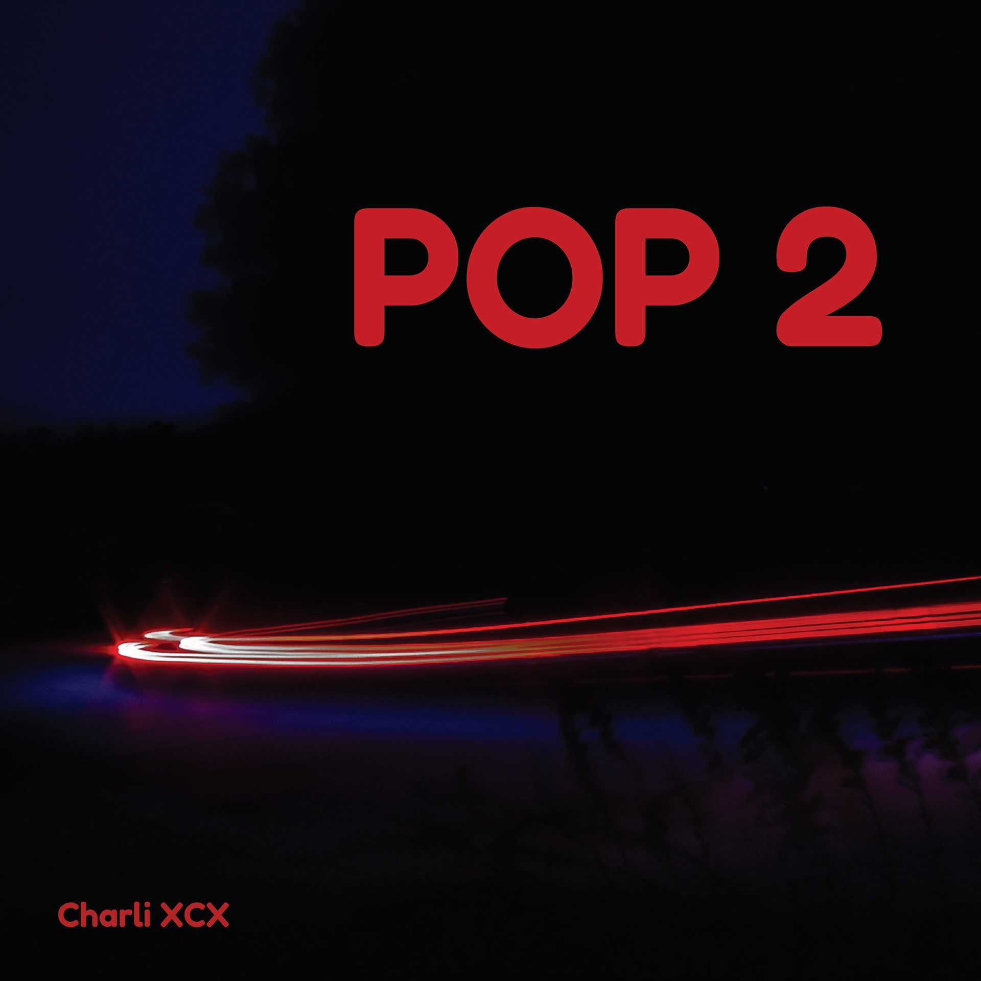
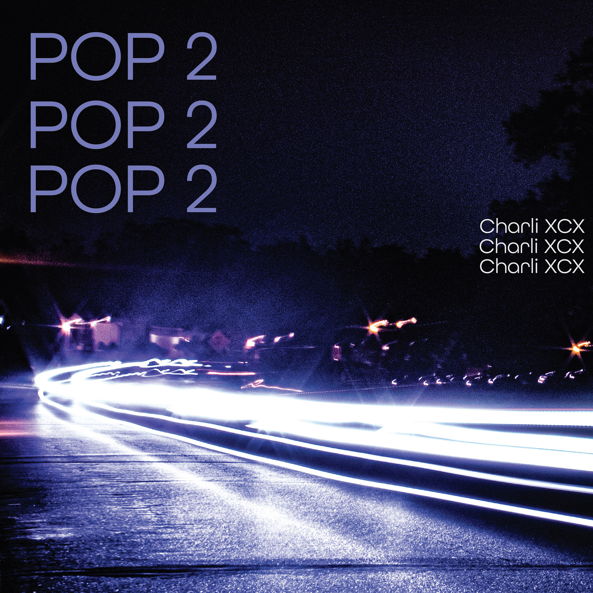
Type variations were explored through changes in color, scale, and font, leading to a system of repetitive but shifting wording. This repetition reinforces the album’s range and intensity, creating consistency while allowing variation
Final Study